CAMH Donor Experience
Overview
CAMH (Centre for Addiction and Mental Health) is Canada’s largest mental health hospital and a global leader in research, treatment, and advocacy. The organization relies on donor support to fund critical programs and innovations, making transparency and trust essential to its digital donation experiences.
The goal of this project was to redesign CAMH’s donor mobile marketplace to better engage millennial donors and increase confidence in the giving process. As part of a focused UX redesign sprint, I worked closely with the client to identify key pain points, including confusing donation flows and a lack of clarity around large-ticket contribution items.
To address these challenges, we simplified the end-to-end donation experience by clarifying user flows, introducing clear cost breakdowns, and surfacing real-world impact stories tied to each donation. These improvements helped rebuild donor trust, made contributions feel more meaningful, and ultimately strengthened engagement across the mobile marketplace.
Impact
Enhanced transparency in donation listings, users could see exactly how funds were used per donation. Optimized copy and clarified hierarchy improved user understanding and flow comprehension. Testing indicated an estimated 24% increase in donations, driven by millennials responding to clearer impact messaging and UX improvements.
Problem and Solution
CAMH’s donor marketplace struggled with transparency, particularly around high-cost items. This led to confusion and mistrust among users, particularly millennials, who were unsure where their donations were being allocated. As a result, engagement declined, and repeat contributions also dropped. I facilitated discovery workshops and led user research to identify key pain points, which helped us uncover the best solution for the client.
Challenge
The main challenge of the CAMH donor mobile marketplace project was helping donors clearly understand where their money was going. Many users found it confusing to see how their donations supported different programs, especially for larger items or initiatives.
Because of this, some donors felt unsure about contributing, which reduced engagement. The donation process also lacked clarity, making it harder for users to quickly understand the impact of their support.
The goal was to simplify the donation experience, clearly show how funds were used, and build trust by highlighting the real impact of each contribution.
Final Flows
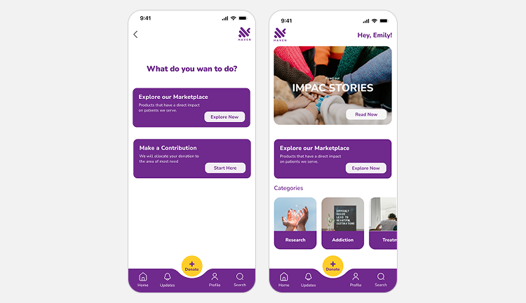
Homepage layout to make key content easier to find and to guide users toward donation and support resources.
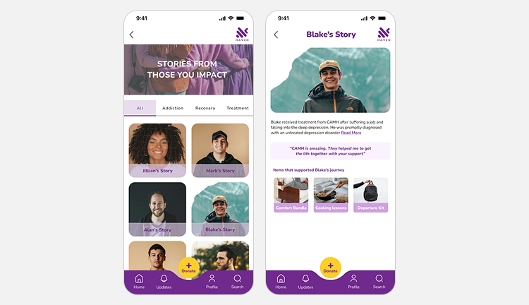
Created a screens for sharing patient stories, combining visuals to encourage users to learn more or donate.
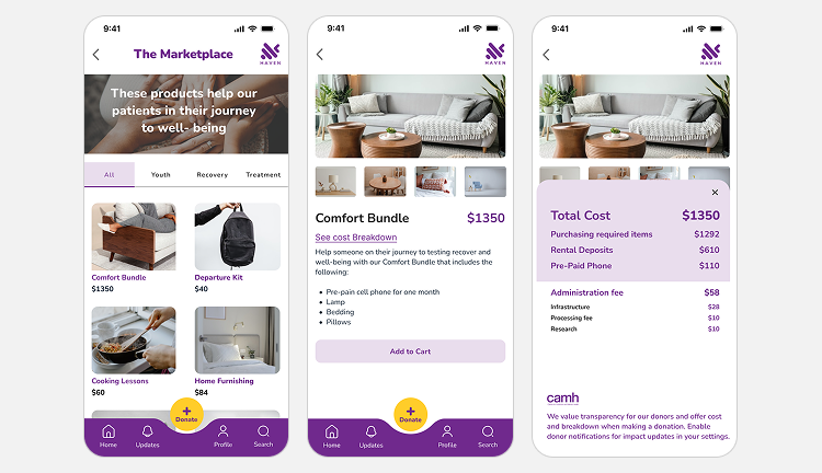
Simplified the donation process by organizing steps clearly, reducing distractions, and making the form easier to complete.