Overview
The City of Toronto collaborated with Scadding Court Community Centre to modernize how residents access community services and facility rentals. The goal was to replace outdated, manual processes with a user-friendly digital portal that supports inclusivity, accessibility, and operational efficiency. Designed with input from both staff and community members, the new system simplifies bookings, enhances communication, and helps ensure that programs and spaces are easy to manage and accessible to all Torontonians.
Impact
- Higher staff efficiency, freeing up time for community programming
- Better user experience, reducing service backlogs and confusion
- Increased access, with an inclusive UI enabling residents to navigate services independently
- Improved operational visibility and planning for centre managers
Problem and Solution
Scadding Court Community Centre offers inclusive, community-focused programs but was held back by outdated, paper-based systems. Staff spent too much time on manual tasks, making it harder to support the community. We built a modern, accessible portal that simplified bookings and day-to-day operations. Staff can now manage rentals through an easy dashboard, residents can fill out digital forms, and the entire experience is designed to be accessible and intuitive for everyone.
Challenges
The main challenge of the SCCC Community Centre Portal project was designing a system that worked for both city staff and community members, many of whom had different levels of comfort with technology. Most of the existing processes were paper-based, which made booking programs and managing services slow and confusing.
The goal was to replace these manual processes with a digital portal that was simple, clear, and easy to use, even for people who were not very tech-savvy.
We also needed to make sure the new workflows reflected how staff actually worked day to day, so the design had to balance community needs, staff operations, and accessibility.
Final Flows

The dashboard offers a snapshot of key center activity, helping staff quickly assess engagement and operational trends. It surfaces real-time data through visual summaries to support informed decision-making.
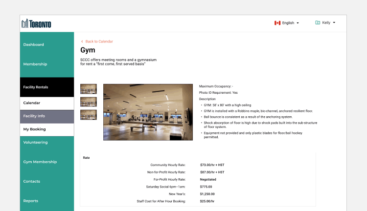
This view lets users browse available facilities such as the gym, lobby, and meeting rooms. After selecting a facility, they can view detailed information including rates, hours, and rental policies to decide if it suits their needs before starting a booking.
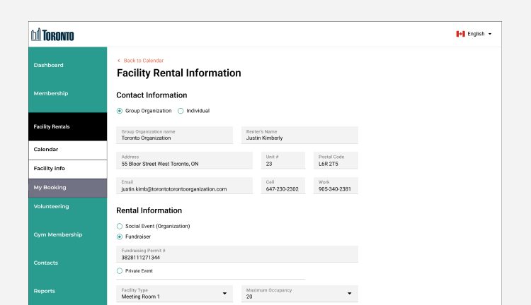
This page is used to fill out and submit a facility rental application. It captures key booking details and requirements to help streamline approval and processing.